
A Little Background Info:
I've been able to see the potential in Wet N' Wild for a while as they have had some stand-out products throughout their time as "that cheap drugstore brand". Namely, their lipliner in shade Brandywine 666 which I've been using for 16 years! Ever since Sophomore year of high school, Brandywine has graced my lips for all major events of my life. But back then I paired it with Revlon Colorstay lipstick in "Sienna" which would be my signature lip combo for years to come. I've since replaced Brandywine with my Chanel lipliner in "Neutral" but it was Brandwine that instilled hope in me that Wet N' Wild was not a throw away brand. Other impressive products being their black gel liner which is the blackest black I've ever used and some of their blush like "Berry Shimmer" is so pigmented that it will last forever. A reviewer once described it as giving the appearance of the cheek color of "Snow White". Even if this isn't true, I admit its what sold me. A big-time drawback to a lot of their products that require plastic cases are the plastic cases. Very flimsy and will break faster than you can even get it opened. I have one in my bathroom drawer shattered to pieces but still has a full amount of product that I'm clinging onto. This is turning into a blush/lipliner review and the following paragraphs will actually relate to the subject of the blog. Read on:
Overall Impressions: Texture
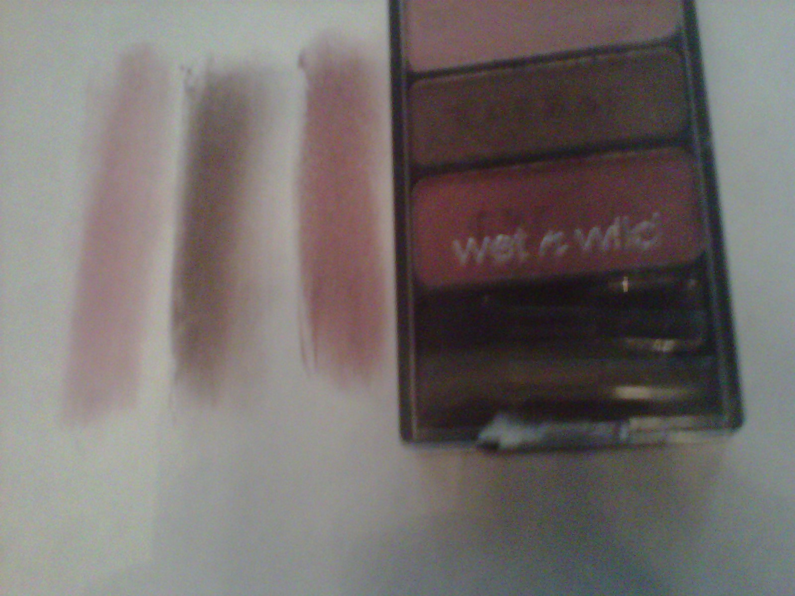
But WnW really grew out of the ugly duckling stage with their Color Icon line. After trying several of the trios, I can safely say that WnW has arrived and it is now their time to shine. I have four of the trios and I would love to get more. I've seen other girls do YouTube videos on the Color Icon eight shadow palettes but I have yet to find them in any of my local drugstores. Back to the review on the products I DO have. The shadows are so soft and buttery smooth that they are almost a cross between a regular powder eyeshadow and a cream eyeshadow. I especially noticed this texture when I was doing the swatches in the enclosed photos and had to rub my finger across the shadow multiple times so I could get a good picture. You certainly don't have to do this to get good color pay-off on your eyes. By far the texture and pigmentation are the qualities most sought after in an eyeshadow and WnW exceeds my expectations in both categories. My opinion is that the Color Icon shadows most resemble the texture of Urban Decay shadows. They are smoother and softer than anything from MAC, NARS, Too Faced, YSL, Chanel, and any single shadow you can find in the drugstore (the list goes on and on).
Overall Impressions: Shade Selection
The shade selection is overall pretty standard and easy to find in several other lines but they did have a few stand-out shades like in the navy/gold/silver-blue trio in my photos. All three of these shades are unique and gorgeous and make for a really good evening eye. For me, I'd wear it in the daytime too. I don't have a daytime look for make-up as it is. I only have a "nightime look" and a "more nightime look." Another very stunning shade can be found (or should I say NOT easily found) in one of the eight-shadow palettes. The palette is called "Blue Had Me At Hello", and the shade is the green/blue on the right side of palette in the enclosed photo. I don't believe that there are individually named shadows with these but I could be wrong. This is one I'd like to get my hands on and I do believe its fairly easy to find on Ebay for around $9.99. Depending on where you purchase the shadow from, I've seen them range anywhere from $3-$4.99. Very good price for the quality you receive. If you are lucky you can get them at a Buy One Get One Free or BOGO 50% off which drugstores are always doing with different brands. Personally, I found it hard to come by a good selection in my CVS, Walgreens, or Wal-Mart. They usually only had a maximum of three different shade trios to choose from. Overall, I think that the neutral shades from the Color Icon shadows could easily be placed in the Urban Decay Naked Palette right along side shades like "Sin"and "Toasted" and no one would be able to tell a difference.
Overall Impressions: My Faves! (and not so faves)
I've been able to see the potential in Wet N' Wild for a while as they have had some stand-out products throughout their time as "that cheap drugstore brand". Namely, their lipliner in shade Brandywine 666 which I've been using for 16 years! Ever since Sophomore year of high school, Brandywine has graced my lips for all major events of my life. But back then I paired it with Revlon Colorstay lipstick in "Sienna" which would be my signature lip combo for years to come. I've since replaced Brandywine with my Chanel lipliner in "Neutral" but it was Brandwine that instilled hope in me that Wet N' Wild was not a throw away brand. Other impressive products being their black gel liner which is the blackest black I've ever used and some of their blush like "Berry Shimmer" is so pigmented that it will last forever. A reviewer once described it as giving the appearance of the cheek color of "Snow White". Even if this isn't true, I admit its what sold me. A big-time drawback to a lot of their products that require plastic cases are the plastic cases. Very flimsy and will break faster than you can even get it opened. I have one in my bathroom drawer shattered to pieces but still has a full amount of product that I'm clinging onto. This is turning into a blush/lipliner review and the following paragraphs will actually relate to the subject of the blog. Read on:
Overall Impressions: Texture
But WnW really grew out of the ugly duckling stage with their Color Icon line. After trying several of the trios, I can safely say that WnW has arrived and it is now their time to shine. I have four of the trios and I would love to get more. I've seen other girls do YouTube videos on the Color Icon eight shadow palettes but I have yet to find them in any of my local drugstores. Back to the review on the products I DO have. The shadows are so soft and buttery smooth that they are almost a cross between a regular powder eyeshadow and a cream eyeshadow. I especially noticed this texture when I was doing the swatches in the enclosed photos and had to rub my finger across the shadow multiple times so I could get a good picture. You certainly don't have to do this to get good color pay-off on your eyes. By far the texture and pigmentation are the qualities most sought after in an eyeshadow and WnW exceeds my expectations in both categories. My opinion is that the Color Icon shadows most resemble the texture of Urban Decay shadows. They are smoother and softer than anything from MAC, NARS, Too Faced, YSL, Chanel, and any single shadow you can find in the drugstore (the list goes on and on).
Overall Impressions: Shade Selection
The shade selection is overall pretty standard and easy to find in several other lines but they did have a few stand-out shades like in the navy/gold/silver-blue trio in my photos. All three of these shades are unique and gorgeous and make for a really good evening eye. For me, I'd wear it in the daytime too. I don't have a daytime look for make-up as it is. I only have a "nightime look" and a "more nightime look." Another very stunning shade can be found (or should I say NOT easily found) in one of the eight-shadow palettes. The palette is called "Blue Had Me At Hello", and the shade is the green/blue on the right side of palette in the enclosed photo. I don't believe that there are individually named shadows with these but I could be wrong. This is one I'd like to get my hands on and I do believe its fairly easy to find on Ebay for around $9.99. Depending on where you purchase the shadow from, I've seen them range anywhere from $3-$4.99. Very good price for the quality you receive. If you are lucky you can get them at a Buy One Get One Free or BOGO 50% off which drugstores are always doing with different brands. Personally, I found it hard to come by a good selection in my CVS, Walgreens, or Wal-Mart. They usually only had a maximum of three different shade trios to choose from. Overall, I think that the neutral shades from the Color Icon shadows could easily be placed in the Urban Decay Naked Palette right along side shades like "Sin"and "Toasted" and no one would be able to tell a difference.
Overall Impressions: My Faves! (and not so faves)
Special Features:
Another plus is that Wet N' Wild does have them labeled as "browbone", "crease", and "eyelid" to show their suggestion for the application and also prove that they are coordinated in such a way to compliment one another and take the guess work out of what to pair with what. People love this, trust me.
I will be purchasing more as I see more of a selection in stores. I'd like to give Wet N' Wild a pat on the back for jumping into the game and possibly winning a few as well. I reach for my Color Icon trios just as often as the Urban Decay Naked Palette and could easily see any one of the shades in my Color Icon Trios right along side of UD favorites like "Sin" or "Toasted".
**In photos: "I Got Good Jeans" (very top), "Sweet As Candy" (below IGGJ), a collection of WnW shades ( below, and not the entire shade selections available), "Walking On Eggshells", "Knock On Wood", two of the 8 shadow Color Icon palettes (very bottom, including the green shade I was talking about)**


Thanks for sharing the information on eye shadow.
ReplyDelete